Technical Analysis Charts
SP500 Data Chart
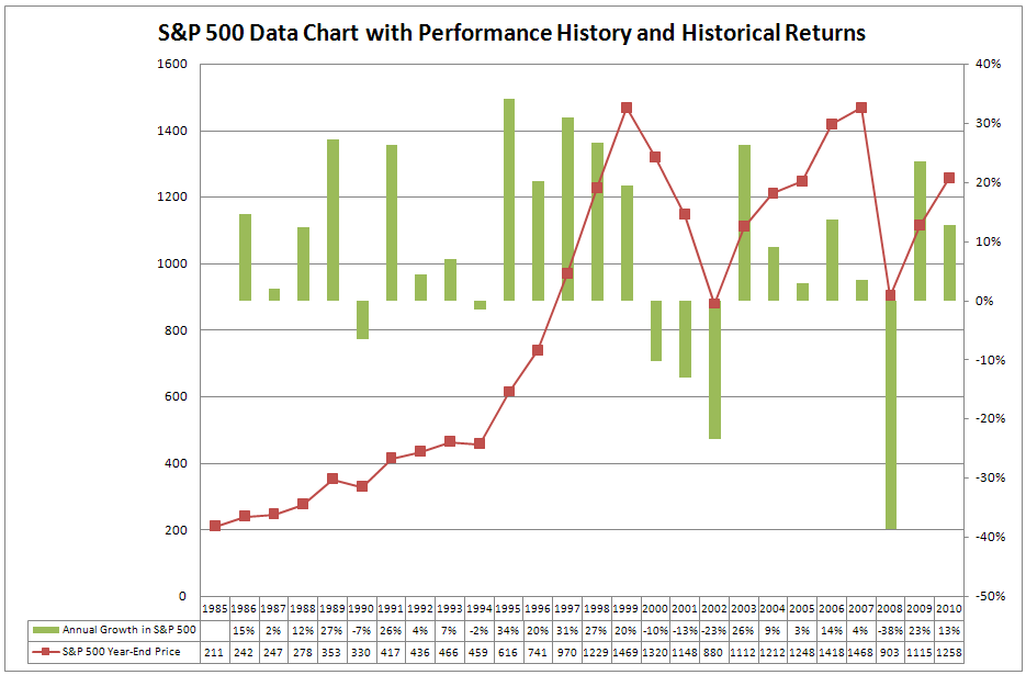
In January 2000, I took a good look at the SP500 data chart. The conclusion was obvious. I had to start investing in the stock market. My salary was fine but everyone around me was making a fortune more in the stock market.
Standing idle was no longer an option for me and I started to invest my savings in the stock market. That did not turn out well as you can see in the chart. The SP500 data shows for the year 2000 a result of minus 10%.
The SP500 data in the chart above shows also that during 1990 and 1994, the SP500 turned negative and that these years were followed by years with excellent results. With this data in mind, I had nothing to fear. Reality proved me wrong.
S&P 500 Trend Investing History Chart - August 2010
Submitted by Van Beek on August 17, 2010 - 09:13Every month, Stock Trend Investing is publishing here one of its history charts for trend investing and trading. This month, this is the history chart for the S&P 500 index.
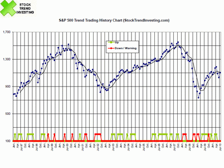
Find here the monthly updated Trend Signals for the
S&P 500. It's free.
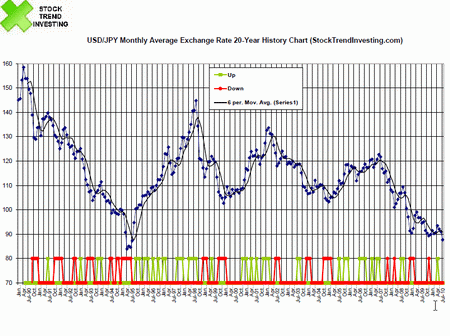
USD/JPY 20-Year Exchange Rate Trend and History Chart - July 2010
Submitted by Van Beek on August 10, 2010 - 02:55This USD/JPY exchange rate and trend chart shows a 20 year history. The US Dollar - Japanese Yen exchange rate is a lot in the news recently since a Dollar buys less and less Yen's. This is the historic perspective. The trend just continues. Click now here to see the historical trend investing performance and what level of results you can expect.
Dow Jones Industrial Averages DJIA Trend Trading History Chart - May 2010
Submitted by Van Beek on June 16, 2010 - 03:51Every month, Stock Trend Investing is publishing one of its trend trading history charts for free. This month, it is the trend trading chart for the Dow Jones Industrial Averages (DJIA) index.
In the chart, the blue line shows the closing price of the Dow Jones Industrial Averages index for that month.
Click here to go to the free Guide on Trend Signals that tell you when to buy and sell.
EUR/USD Exchange Rate Trend and History Chart: 20 Years
Submitted by Van Beek on June 9, 2010 - 07:26This chart for the EUR/USD exchange rate and trend shows a 20 year history. Since the Euro exists only for about 10 years we had to make some calculations. You will see later below. 20 years provides a unique historic perspective.
Trends in currency exchange rates are important for investors who invest outside their home currency zone. A foreign stock market index could move up but the currency for that market could devalue compared to your home currency. In that case, your gains measured in your home currency would reduce or could even turn negative.
BSE Sensex Trend Trading History Chart - April 2010
Submitted by Van Beek on May 18, 2010 - 04:46Every month, Stock Trend Investing is publishing one of its trend trading history charts for free. This month, it is the trend trading chart or the Indian BSE Sensex.
The blue line shows the closing price of the BSE Sensex index for that month.
The green line signals when our Initial Trend Expectation for the BSE Sensex was "Up". The red line signals when our Initial Trend Expectation for the BSE Sensex was "Down" or when there was a special warning.
Find here the analysis on the correlation between the Nifty and the BSE Sensex.
Nasdaq Historic Trend Trading Chart - March 2010
Submitted by Van Beek on April 8, 2010 - 12:24Every month, Stock Trend Investing is publishing one of its historic trend trading charts for free. This month, it is the trend trading chart or the Nasdaq.
The blue line shows the closing price of the Nasdaq index for that month.
The green line signals when our Initial Trend Expectation for the Nasdaq was "Up". The red line signals when our Initial Trend Expectation for the Nasdaq was "Down" or when there was a special warning.
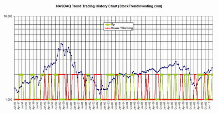
Click and drag the chart to a tab in your browser to see an enlargement.
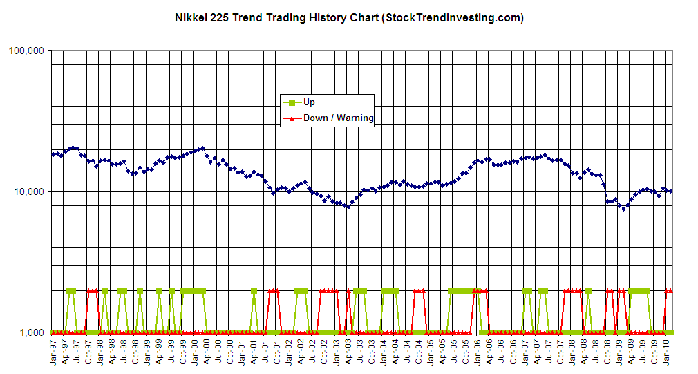
Nikkei Historic Trend Trading Chart - February 2010
Submitted by Van Beek on March 18, 2010 - 07:42Every month, Stock Trend Investing is publishing one of its historic trend trading charts for free. This month, it is the trend trading chart or the Nikkei 225, the index of the Japanese stock market in Tokyo.
The blue line shows the closing price of the Nikkei index for that month.
The green line signals when our Initial Trend Expectation for the Nikkei was "Up". The red line signals when our Initial Trend Expectation for the Nikkei was "Down" or when there was a special warning.
Log in or register on this website to download the chart at the bottom of this page. You can also click and drag the chart to a tab in your browser to see an enlargement.